Black Door Stays
Working with Black Door Stays to redesign and re-envision their branding to align with their website.
Being new to online marketing, Black Door Stays needed a fresh new look to go alongside their online presence.
"We want to show you that staying with us is more of an experience rather than just a 'roof over your head'. We pride ourselves in knowing the local areas and look forward to sharing with you all the best that our home from homes has to offer."
Working with the team and learning more about the company's goals and ideas, we defined keywords that highlighted the key values that would always be in mind and would be used in the further steps in creating the branding.
Services Provided
Web Design
API Integration
Branding
UX / UI Design
Web Development
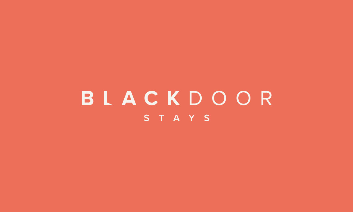
The new branding for Black Door Stays gives the direction and image that they deserve.
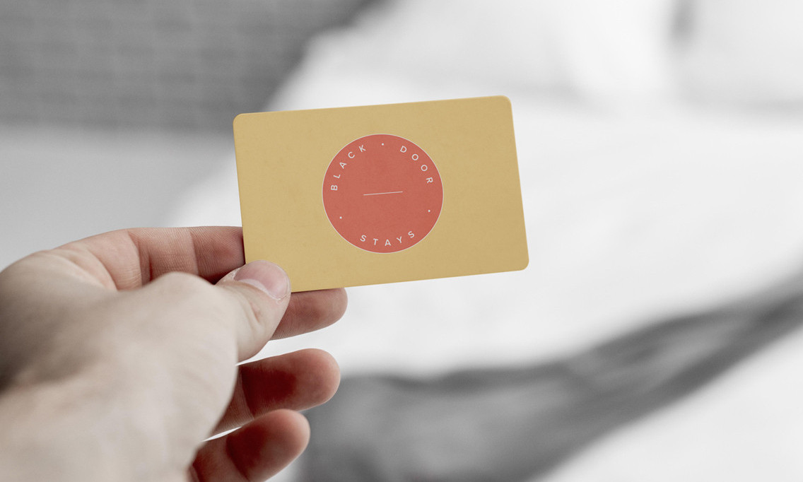
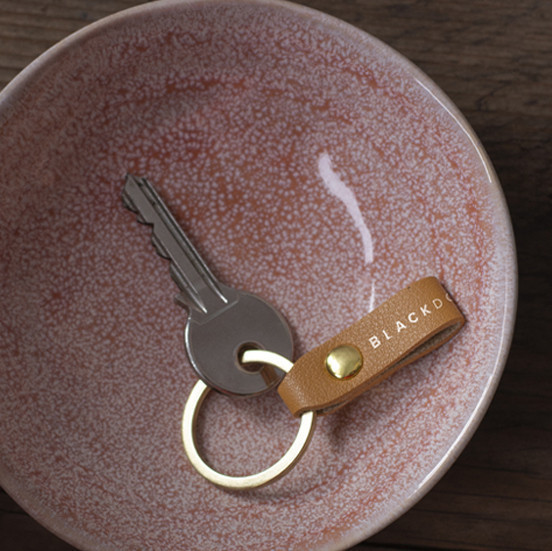
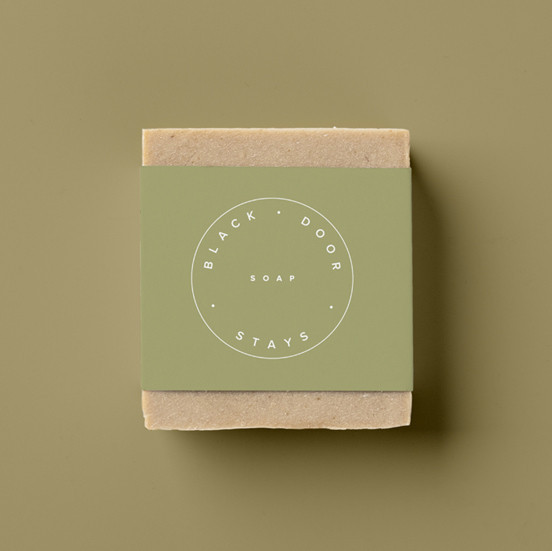
Working with the team, we decided to create a logo that would align with their brand ethos, one that would be fresh and contemporary as well as approachable and warm. It would exude a sense of professionalism and trust to reflect the services and time commitment Black Door Stays wanted to offer.
Liaising closely with the client and shortlisting 3 variants, the company selected this final logo style to bear their brand. This logo cleverly and subtly emphasises the company name by turning the "L" of the word "black" into an open door. The font is clean and minimal which works well with the warm and homely colour palette.
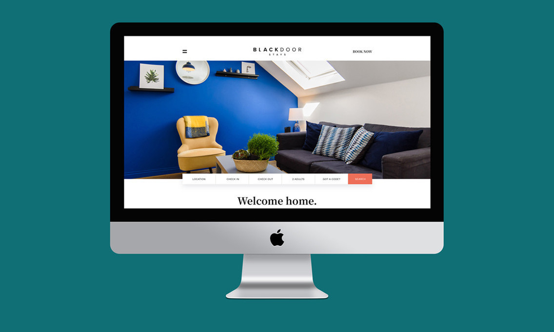
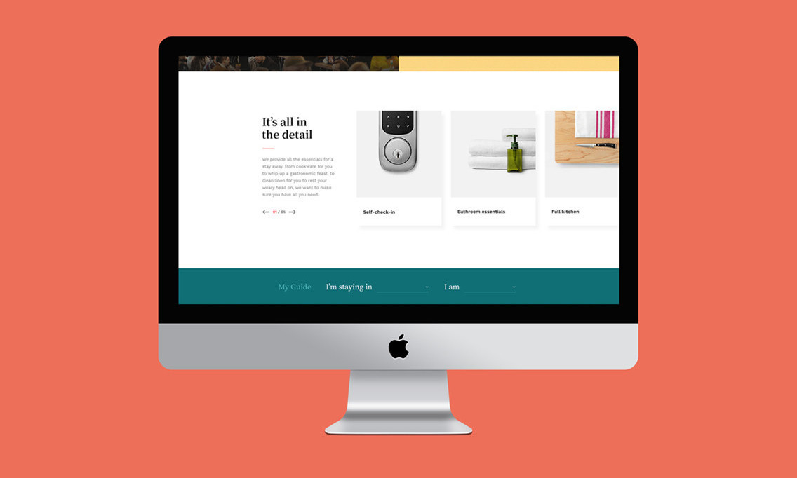
Once the branding was complete, the company was in the perfect position to begin building their online presence. Black Door Stays wanted a new website created that would allow their customers to book a holiday on their website hassle-free.
Collaborating with the team, we were able to design a website with a clear user journey that would welcome their customers. It's been a very rewarding journey to work with this brand across multiple areas and see them grow online.
